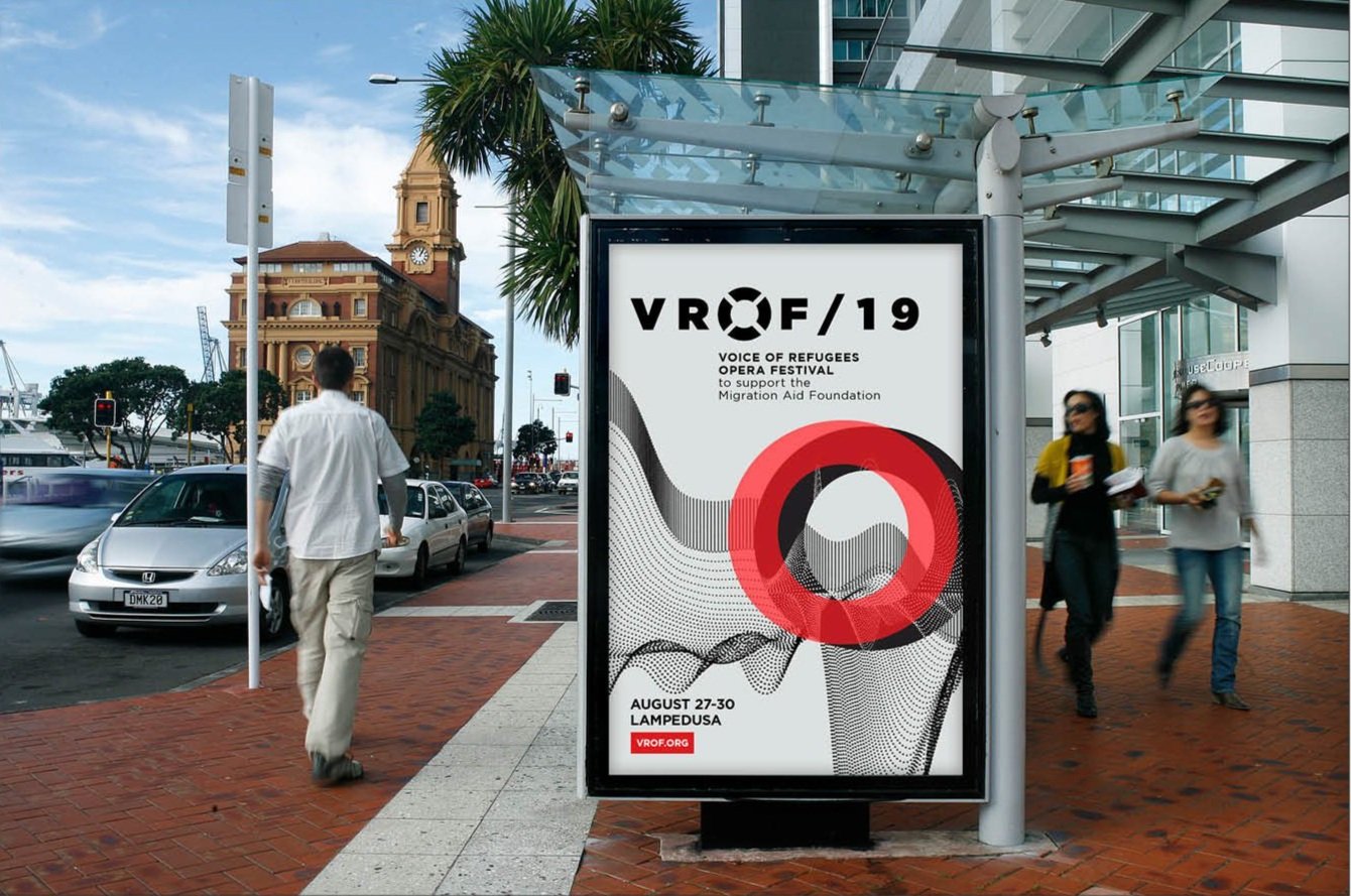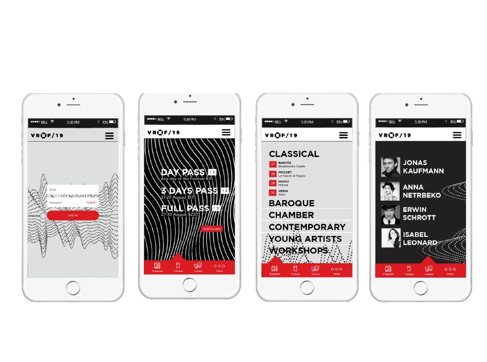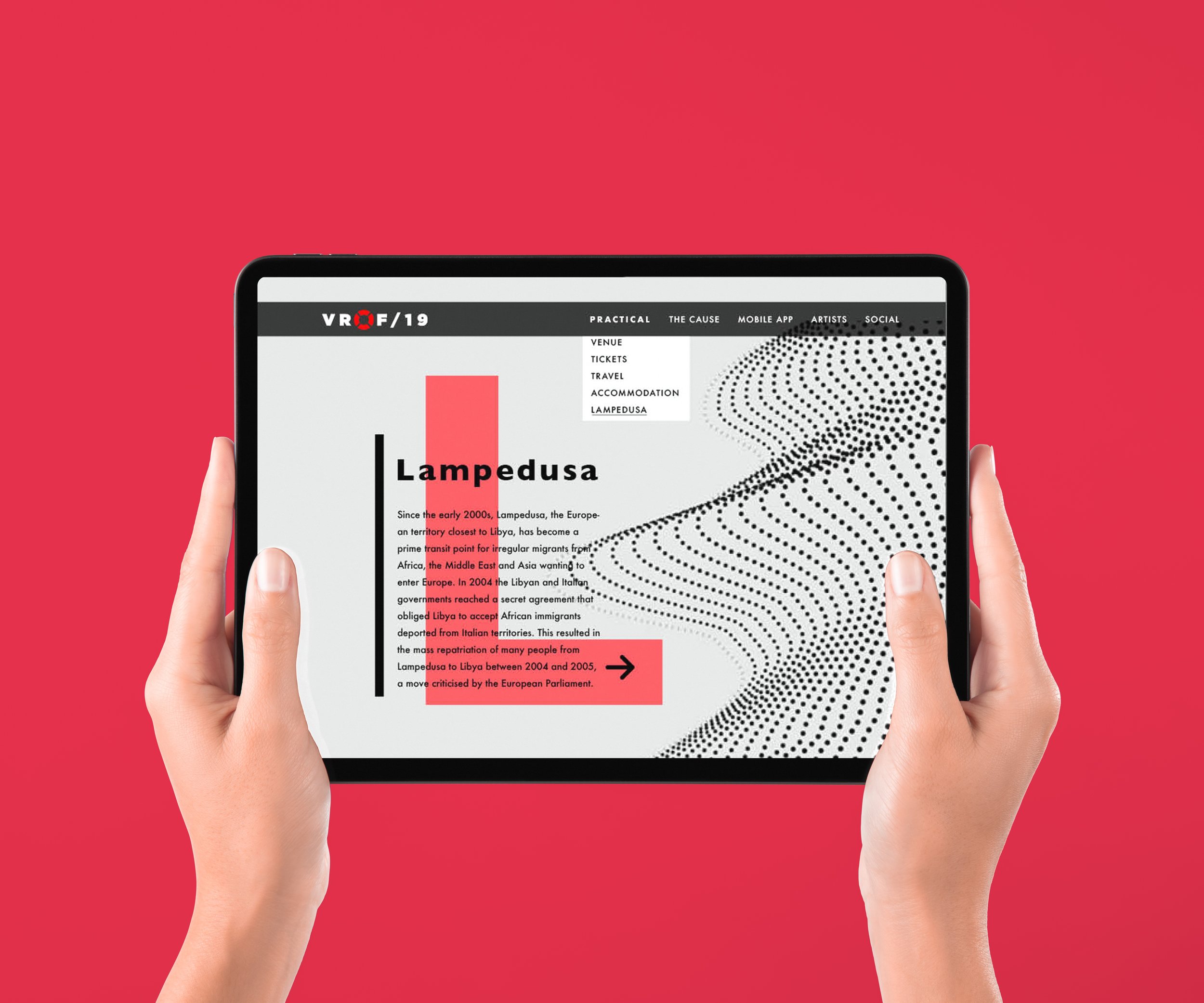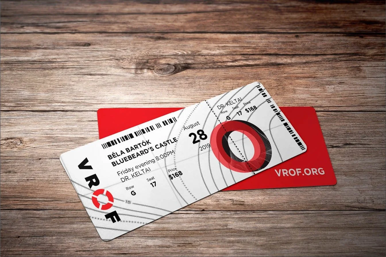

Voice of Refugees Opera Festival
Since this is an imaginary event, I took an intensely personal approach, blending two subjects close to me—opera and the refugee crisis in Europe. To express this visually, I combined ocean topography with sound wave graphics, creating a layered, symbolic language. Red serves as the accent color, representing both passion and violence, while a simple, bold humanist typeface ensures the visuals remain stable and strong.
Categories: Event branding, visual identity, application design, interaction design
Semester: Fall 2018
Class: Visual Systems 1
Instructor: Troy Alders